Featuring the image of a bridge, supplemented with the imprint of a traditional Chinese seal, the logo of the upcoming G20 summit was born in an abandoned cement plant in the suburb of the host city of Hangzhou, Zhejiang Province.[Special coverage]
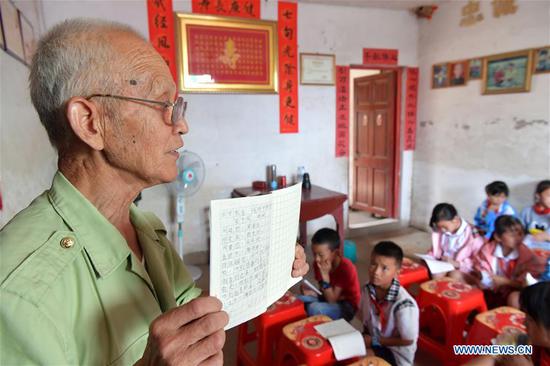
Eight years ago, these deserted plants were turned into a cultural and creative industry park and Yuan Youmin of the China Academy of Art in Hangzhou moved his design studio there.
In 2007, Hangzhou began to dream of becoming a cultural and creative center. Nine years on and creative industries represent some 22 percent of local GDP.
Born in 1971 in Anhui Province, Yuan first came to Hangzhou as a high school graduate. "At that time, the West Lake impressed me most with its arched bridges looming from the mizzle," he said.
Hangzhou's bridges were praised by Italian traveler Marco Polo in the 13th century who called Hangzhou with its 12,000 bridges a city built on water.
"Some have asked me which bridge inspired the logo. Well, I should say that it is a bridge of the spiritual level," Yuan said. The logo combines openness, inclusiveness, understanding and communication. Bridges connect people and places in many different ways, "just as the G20 brings East and West together in dialogue," he said.
The bridge is composed of 20 lines, and the arch of the bridge forms a circle with its reflection. "The 20 lines represents the 20 members of the group, and the round arch implies that it is a round table meeting in which all are equal."
The red seal of the characters of "China" besides the bridge is not only a symbol of culture, but also carries the meaning of promise, as seals represent contractual relationships, he said.
"We want to present Chinese elements in a poetic, natural and concise way," Yuan added.
After the release of the logo on December 1, 2015, the design team spent another three months making a set of handbooks detailing the various manifestations of the logo on different objects and occasions.
Yuan said, graphic design in China has been growing from simple copying of Western styles 30 years ago to exploring distinctive Chinese motifs.
"Hopefully our G20 logo can heighten public awareness of graphic design," he said. "A good design is a carrier of culture, boasting both utility and beauty."
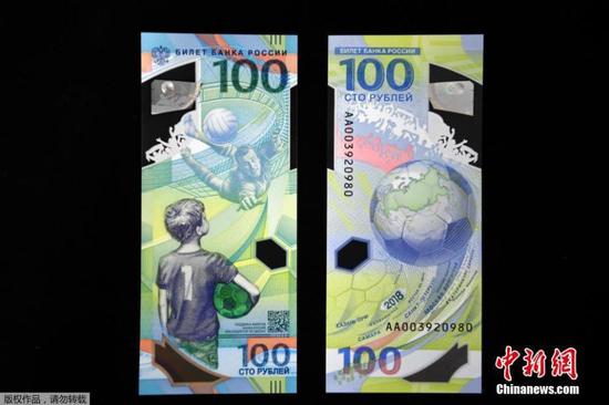
 ĪĪĪĪ
ĪĪĪĪ